[python]Visualize the distribution of data according to the values of two items
- Aug 13, 2021
- 2 min read
Overview
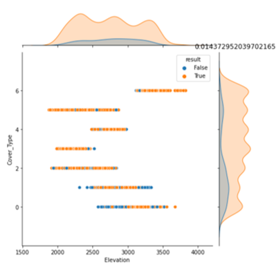
You can use seaborn's count plot or displot to visualize the distribution of data. Also, if you want to visualize the distribution of data according to the value of a certain item, you can use jointplot or the argument hue of countplot (example: Fig. 1).
Previously, I introduced a method to visualize the distribution according to the value of a certain item according to the attribute (discrete quantity or continuous quantity) of each variable.
This time, I will extend it and introduce a method to visualize the distribution of data according to the values of two items.

Method
The appropriate methods for the attributes of the explanatory variable (the variable whose distribution you want to check) and the objective variable (you want to check the distribution according to its value) are as follows.

Add a new argument hue to the argument of the previously created visualize_data method. Pass the key name of the second classification data to this.
def visualize_data(data, target_col, categorical_keys=None, hue=None):Case of jointplot、violineplot
I do not yet use the argument hue in these methods, so I can use the argument hue.
sg=sns.jointplot(x=key, y=target_col, data=data, height=length*2/3,
                hue=hue)
Case of countplot
In the case of countplot, the argument hue has already been used. Therefore, I will separate the plot for each value of the second data.
Change the method to use to catplot and set kind to 'count'. If you pass a variable to the argument row of catplot, the plot will be divided for each variable. (If you pass it to row, it will line up horizontally, and if you pass it to col, it will line up vertically.)
sns.catplot(x=key, data=data, hue=target_col, row=hue, kind='count')Case of distplot
Similarly, since the argument hue has been used, I also divide the plot for each value of the second data.
g=sns.FacetGrid(data, hue=target_col, row=hue)
g.map(sns.distplot, key, ax=axes[1], kde=False)
The whole code is as follows. See the previous page for the original methods used internally.
def visualize_data(data, target_col, categorical_keys=None, hue=None):

    keys=data.keys()

    if categorical_keys is None:
        categorical_keys=keys[[is_categorical(data, key) for key in
        keys]]

    for key in keys:
        if key==target_col or key==hue:
            continue

    length=10
    subplot_size=(length, length/2)

    if (key in categorical_keys) and (target_col in categorical_keys):

        r=cramerV(key, target_col, data)

        fig, axes=plt.subplots(1, 2, figsize=subplot_size)
        sns.countplot(x=key, data=data, ax=axes[0])
        sns.catplot(x=key, data=data, hue=target_col, row=hue,
        kind='count')
        plt.title(r)
        plt.tight_layout()
        plt.show()

    elif (key in categorical_keys) and not (target_col in
          categorical_keys):

          r=correlation_ratio(cat_key=key, num_key=target_col,
          data=data)

          fig, axes=plt.subplots(1, 2, figsize=subplot_size)
          sns.countplot(x=key, data=data, ax=axes[0])
          sns.violinplot(x=key, y=target_col, data=data, ax=axes[1],
          hue=hue)
          plt.title(r)
          plt.tight_layout()
          plt.show()

    elif not (key in categorical_keys) and (target_col in
         categorical_keys):

         r=correlation_ratio(cat_key=target_col, num_key=key,
         data=data)

         fig, axes=plt.subplots(1, 2, figsize=subplot_size)
         sns.distplot(data[key], ax=axes[0], kde=False)
         g=sns.FacetGrid(data, hue=target_col, col=hue)
         g.map(sns.distplot, key, ax=axes[1], kde=False)
         axes[1].set_title(r)
         axes[1].legend()
         plt.title(r)
         plt.tight_layout()
         plt.show()

    else:

        r=data.corr().loc[key, target_col]

        sg=sns.jointplot(x=key, y=target_col, data=data,
                         height=length*2/3, hue=hue)
         plt.title(r)
         plt.show()
The result is as follows (only a part is displayed). Plot the distribution of the data according to the values of the two items 'Cover_Type' and 'result'.
visualize_data(data=data_res, target_col='Cover_Type', hue='result')

Lastly
The most common use is to add the prediction result from the model to a column of data and see the distribution of the data according to the two values, this and the target value.


Comments